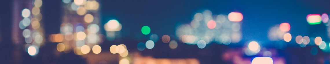
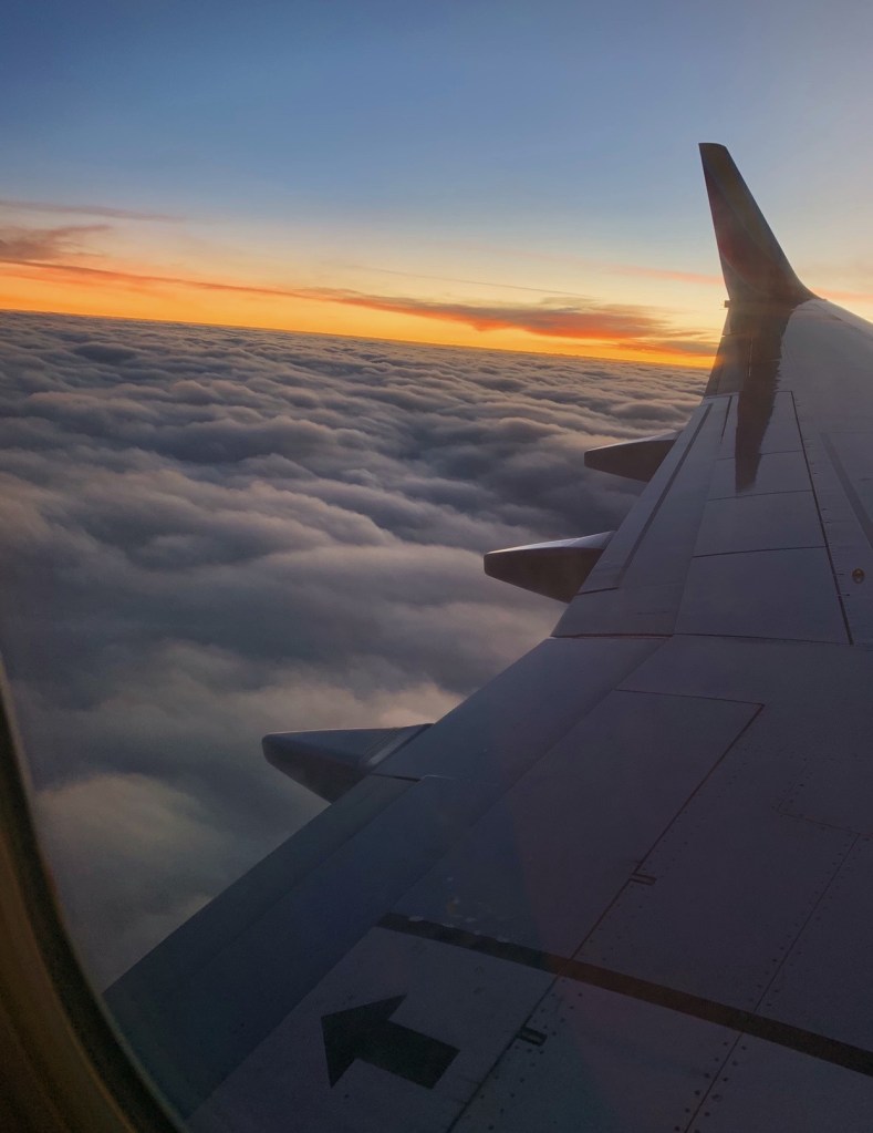
After (increased brightness and contrast, vibrancy, added saturation)
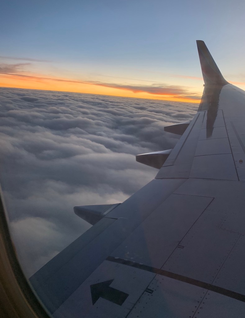
Before
After (reduced brightness, increased contrast and saturation, added a bit of hue, increased exposure just a bit)
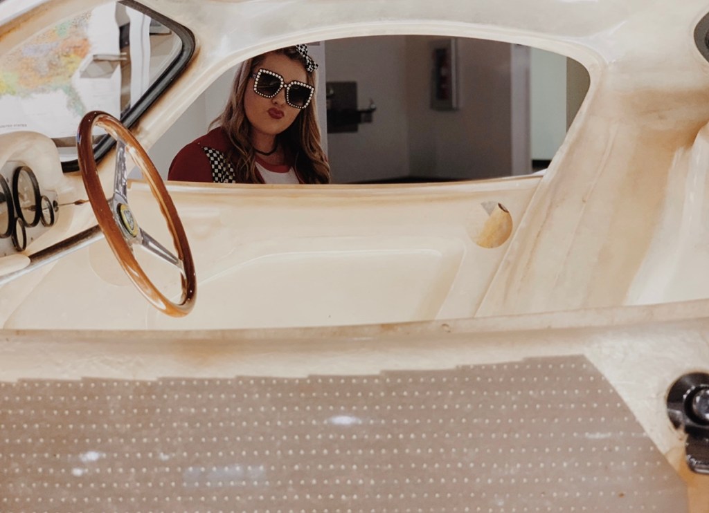
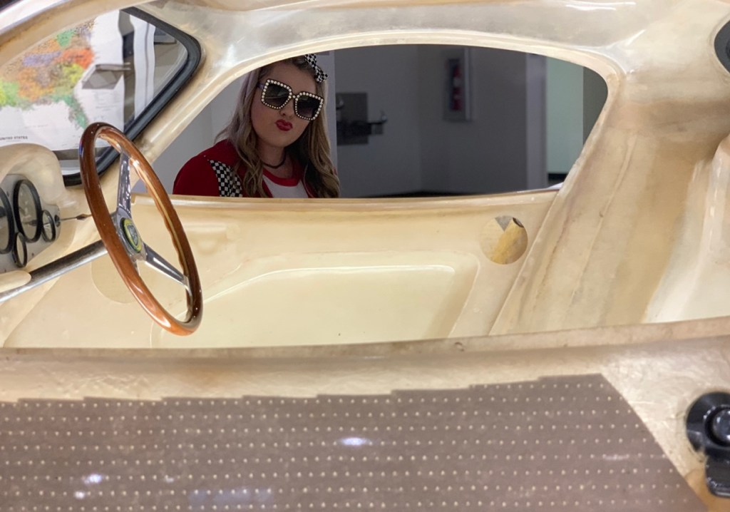
After (decreased brightness, increased saturation, increased hue to gain a more vintage vibe)
Before
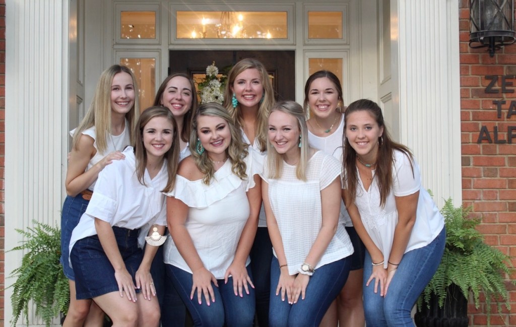
Before
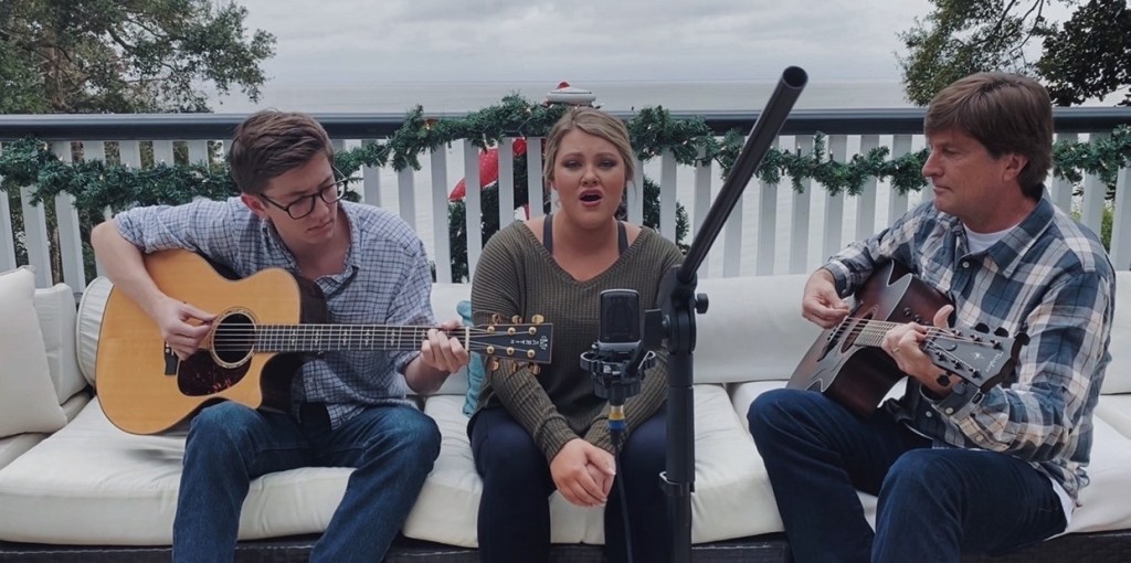
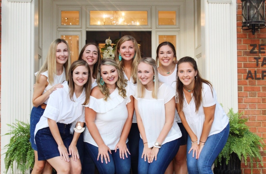
After (increased contrast and saturation quite a bit, decreased exposure, turned down the brightness.. really wanted Joe to “pop” in this shot)
Before
After (Decreased brightness, increased vibrancy and contrast, narrowed in on the green and red colors to add more dimension)
Before
After (I felt like the “before” of this pic was really flat, so I started by increasing saturation and contrast, turned down the exposure, and refocused the white balance since that color dominates this photo)
Before
After (The lighting on the original photo was lacking, so I increased exposure and brightness, played around with color balance, and added a bit of vibrancy)
Before
After (I really wanted the colors in this pic to “pop”, so I focused on the red and greens to make the subjects and background separate from each other. I increased saturation and vibrancy)
Before
After (this photo looked super flat before, so I started by turning up the exposure and then adding in saturation. I also brightened the background a bit to expose the castle more)
Before
After (I noticed how red the subjects looked, so I played around with hue to give them more of a warmer look in their skin tones. I turned down the saturation a bit and also added some contrast for all subjects to stand out)